Perhaps the most important new thing I note is that Pro Football Reference now has play by play data, and ways to display those data as a CSV format. Creating parsers for the data would be work, but that means that advanced stats are now accessible to the average fan.

In Ubuntu 16.04, PDL::Stats is now a standard Ubuntu package and so the standard PDL installation can be used with my scripts. About the only thing you need to use CPAN for, at this point, is installing Sport::Analytics::SimpleRanking.

At work I use a lot of Python these days. I have not had time to rethink all this into Pythonese. But I’m curious, as the curve fitting tools in Python are better/different than those in Perl.

Football diagrams: Although the Perl module Graphics::Magick isn’t a part of CPAN, graphicsmagick and libgraphics-magick-perl are part of the Ubuntu repositories.

There are two well known adjusted yards per attempt formulas, which easily reduce to simple scoring models. The first is the equation  introduced by Carroll et al. in “The Hidden Game of Football“, which they called the  New Passer Rating.

(1) AYA = (YDs + 10*TDs- 45*INTs)/ ATTEMPTS

And the Pro Football Reference formula currently in use.

(2) AYA  = (YDs +20*TDs – 45*INTs)/ATTEMPTS.

Scoring model corresponding to the THGF  New Passer Rating, with opposition curve also plotted. Difference between curves is the turnover value, 4 points.

Scoring model corresponding to the THGF New Passer Rating, with opposition curve also plotted. Difference between curves is the turnover value, 4 points.

Formula (1) fits well to a scoring model with the following attributes:

  • The value at the 0 yard line is -2 points, corresponding to scoring a safety.
  • The slope of the line is 0.08 points per yard.
  • At 100 yards, the value of the curve is 6 points.
  •  The value of a touchdown in this model is 6.8 points.

The difference, 0.8 points, translated by the slope of the line,  (i.e 0.8/0.08) is equivalent to 10 yards. 4 points, the value of a turnover, is equal to 50 yards. 45 was selected to approximate a 5 yard runback, presumably.

Pro Football Reference AYA formula translated into a scoring model. Difference in team and opposition curves, the turnover value, equals 3.5 points.

Pro Football Reference AYA formula translated into a scoring model. Difference in team and opposition curves, the turnover value, equals 3.5 points.

Formula (2) fits well to a scoring model with the following attributes:

  • The value at the 0 yard line is -2 points, corresponding to scoring a safety.
  • The slope of the line is 0.075 points per yard.
  • At 100 yards, the value of the curve is 5.5 points.
  • The value of a touchdown in this model is 7.0 points.

The difference, 1.5 points, translated by the slope of the line,  (i.e 1.5/0.075) is equivalent to 20 yards. 3.5 points, the value of a turnover, is equal to 46.67 yards. 45 remains in the INT term for reasons of tradition, and the simple fact this kind of interpretation of the formulas wasn’t available when Pro Football Reference introduced their new formula. Otherwise, they might have preferred 40.

Adjusted yards per attempt or adjusted expected points per attempt?

Because these models show a clearly evident relationship between yards and points, you can calculate expected points from these kinds of formulas. The conversion factor is the slope of the line. If, for example, I wanted to find out how many expected point Robert Griffin III would generate in 30 passes, that’s pretty easy, using the Pro Football Reference values of AYA. RG3’s AYA is 8.6, and 0.075 x 30  = 2.25. So, if the Skins can get RG3 to pass 30 times, against a league average defense, he should generate 19.35 points of offense. Matt Ryan, with his 7.7 AYA, would  be expected to generate 17.33 points of offense in 30 passes. Tony Romo? His 7.6 AYA corresponds to  17.1 expected  points per 30 passes.

Peyton  Manning, in his best  year, 2004, with a 10.2 AYA, could have been expected to generate 22.95 points per 30 passes.

This simple relationship is one reason why, even if you’re happy with the correlation between the NFL passer rating and winning  (which is real but isn’t all that great), that  you should sometimes consider thinking in terms of AYA.

A Probabilistic Rule of Thumb.

If you think about these scoring models in a simplified way, where there are only two results, either a TD or a non-scoring result, an interesting rule of thumb emerges. The TD term in equation (1) is equal to 10 yards, or 0.8 points. 0.8/6.8 x 100 = 11.76%, suggesting that the odds of *not* scoring, in formula (1), is about 10%. Likewise, for equation (2) whose TD term is 20, 1.5/7 x 100 = 21.43%, suggesting the odds of *not* scoring, in formula (2), is about 20%.

I’ve been looking at this model recently, and thinking.

Backstory references, for those who need them: here and here and here.

Pro Football Reference’s AYA statistic as a scoring potential model. The barrier potential represents the idea that scoring chances do not become 100% as the opponents goal line is neared.

If the odds of scoring a touchdown approach 100% as you approach the goal line, then the barrier potential disappears, and the “yards to go” intercept is equal to the value of the touchdown. The values in the PFR model appear to always increase as they approach the goal line. They never go down, the way real values do. Therefore, the model as presented on their pages appears to be a fitted curve, not raw data.

The value they assign the touchdown is 7 points. The EP value of first and goal on the 1 is 6.97 points. 6.97 / 7.00 * 100 = 99.57%. How many of you out there think the chances of scoring a touchdown on the 1 yard line are better than 99%?

More so, the EP value, 1st and goal on the 2 yard line is 6.74. Ok, if the fitting function is linear, or perhaps quadratic, then how do you go 6.74, to 6.97, to 7.00? The difference between 6.74 and 6.97 is 0.23 points. Assuming linearity (not true, as first and 10 points on the other end of the curve typically differ by 0.03 points per yard), you get an extrapolated intercept of 7.20 points.

The PFR model has its issues. The first down intercept seems odd, and it lacks a barrier potential. To what extent this is an artifact of a polynomial (or other curve) fitted to real data remains to be seen.

Update: added a useful Keith Goldner reference, which has a chart giving probabilities of scoring a touchdown.

After watching one or another controversy break out during the 2011 season, I’ve become convinced that the average “analytics guy” needs a source of play-by-play data on a weekly basis. I’m at a loss at the moment to recommend a perfect solution. I can see the play-by-play data on NFL.com, but I can’t download it. Worst case, you would think you could save the page and get to the data, but that doesn’t work. I suspect the use of AJAX or equivalent server side technology to write the data to the page after the HTML has been presented. Good for business, I’m sure, but not good for Joe Analytics Guy.

One possible source is now Pro Football Reference (PFR), which now has play by play data in their box scores, and has tended to present their data in AJAX free, user friendly fashion. Whether Joe Analytics Guy can do more than use those data personally, I doubt. PFR is purchasing their raw data from another source. And whatever restrictions the supplier puts on PFR’s data legally trickle down to us.

Further, along with the play by play, PFR is now calculating expected points (EP) along with the play by play data. Thing is, what expected point model is Pro Football Reference actually using? Unlike win probabilities, which have one interpretation per data set, EP models are a class of related models which can be quite different in value (discussed here, here, here). If you need independent verification, please note that Keith Goldner now has published 4 separate EP models (here and here), his old Markov Chain model, the new Markov Chain model, a response function model, and a model based on piecewise fits.

That’s question number one. Question that have to be answered to answer question one are things like:

  • How is PFR scoring drives?
  • What is their value for a touchdown?
  • If PFR were to eliminate down and distance as variables, what curve do they end up with?

This last would define how well Pro Football Reference’s own EP model supports their own AYA formula. After all, that’s what a AYA formula is, a linearized approximation of a EP model where down and to go distance are ignored, with yards to score is the only independent variable.

Representative Pro Football Reference EP Values
1 yard to go 99 yards to go
Down EP Down EP
1 6.97 1 -0.38
2 5.91 2 -0.78
3 5.17 3 -1.42
4 3.55 4 -2.49


My recommendation is that PFR clearly delineate their assumptions in the same glossary where they define their version of AYA. Make it a single click lookup, so Joe Analytics Guy knows what the darned formula actually means. Barring that, I’ve suggested to Neil Paine that they publish their EP model data separately from their play by play data. A blog post with 1st and ten, 2nd and ten, 3rd and ten curves would give those of us in the wild a fighting chance to figure out how PFR actually came by their numbers.

Update: the chart that features 99 yards to go clearly isn’t 1st and 99, 2nd and 99. Those are 1st and 10 values, 2nd and 10, etc at the team’s 1 yard line. The only 4th down value of 2011, 99 yards away, is a 4th and 13 play, so that’s what is reported above.

This has been part of an ongoing conversation among Dallas fans, and perhaps among any of the 9 teams, from the Redskins to Patriots to the Vikings, that traded up in the first round of the 2012 NFL draft. There are some new tools for the analyst and the fan, and these include: (1) Pro Football Reference’s average AV per draft choice list, (2)  Pro Sports Transactions’ NFL draft trade charts, and (3) The Jonathan Bales’ article on Dallas Cowboys.com where he analyzes a series of first round trades up from 2000 to 2010. He concludes that in general, the trade up does not return as much value as it gives.

I suspect that Jonathan’s conclusion is also evident in the fantasydouche.com plot we reposted here. The classic trade chart of Jimmy Johnson really does overvalue the high end draft choices. You’re not paying for proven value, but rather potential when you trade up. I suspect by the break even metric we chose, comparing relative average AVs, that many draft trades never pay off, in part because people pay too much for the  value they receive. This is most evident in trading a current second or third and a future first for a current first round draft choice. These trades tend almost to be failures by design, and smack ultimately of desperation, true even when the player obtained (e.g. Jason Campbell) actually has some skills.

That said, how many of these players exceed the average abilities of the slot in which they were drafted? Now that we have the PFR chart, this is another question that can be asked of the first round players. Note that Jonathan Bales’ study doesn’t really answer the question of how good the player becomes, in part because the time frame chosen doesn’t allow the player adequate development. I started in the year 2000 1995, ended in the year 2007. I identified 67 players in that time frame, and I compared the AV for each player as given by the weighted average on the PFR player page. I’ll note that the player page and the annual draft pages do not agree on players’ weighted career accumulated value, so I assumed the personal pages were more accurate.

As far as a scale, we’re using the following:

AV relative to average Ranking
-25 AV or more Bust
-24 to -15 AV Poor
-14 to -5 AV Disappointing
-4 to +4 AV Satisfactory
+5 to +14 AV Good
+15 to +24 AV Very Good
+25 AV and up Excellent

 
Note there are some issues with the scale. Plenty of players from 1995 through 2007 are still playing, and their rankings are almost certainly going to change. In particular, Eli Manning at +24 and Jay Cutler at +23 have a great chance to end up scored as Excellent before the next season is over. Jason Campbell is at +19, and if he starts for a team for one season, he will end up with a ranking of Excellent. Santonio Holmes (+19) also has a shot at the Excellent category.

Players in the years 2006 and 2007 in lower categories (Manny Lawson at +7, Joe Staley at +4, Anthony Spencer at 0 ) could end up as Very Good, perhaps even Excellent if their careers continue.

The scoring ended up as

Scale Number Percent as Good Percent as Bad
Excellent 14 20.9 100.0
Very Good 9 34.3 79.1
Good 13 53.7 65.7
Satisfactory 10 68.7 46.3
Disappointing 7 79.1 31.3
Poor 5 86.6 20.9
Bust 9 100.0 13.4

 
Data came from the sources above. A PDF of these raw data is here:

NFL Trade Ups

Update: Increased the dates of players considered from 2000-2007 to 1995-2007. Moved Ricky Williams back to 1999.

There were, of course, two substantial trades of Ricky Williams. The first netted the Washington Redskins the whole of the Saints 1999 draft, plus the Saint’s first and third round picks of 2000. Three years later, Ricky was traded to the Miami Dolphins for a pair of first rounders, plus change. The first was obviously not paid off. How did the Miami Dolphins fare in their trade, using our new risk metrics?

Risk Ratio no longer makes sense as a term when you’re talking about someone already drafted. The important term becomes the net risk term, 52 AV. That’s 1 more AV than the typical #1 draft choice, and that’s the amount of AV Ricky had to generate in order for this trade to break even. And note, these calculations are derived from weighted career AV, not raw AV. So any raw AV we apply to these numbers is a rough approximation (A typical career summing to, say, 95 AV, might end up around 76 or so WCAV).

That said, Ricky Williams had a great first season with the Dolphins, generating 19 AV in that season alone. His total ended up somewhere around 57 AV. I’d suggest the second trade approximately broke even.

End notes: I’ve seen a lot of discussion around  this set of data, discussing the quality of draft picks on a per pick basis, posted in of all places, a Cav’s board. If this board isn’t the original source of these graphs, please let me know. An excellent resource for high quality NFL draft trade information is here. And finally, a reader named Frank Dupont writes:

I wrote a book about decision making in the NFL.  It’s sort of a pop science book because it seeks to make what happens in the NFL understandable via some work that people like David Romer, Richard Thaler, and Daniel Kahneman have done.  But because all pop science books make their point through narrative, I spend a lot of time looking at why football coaches are so old, but other game players like chess players and poker players are so young (Tom Coughlin is 65 and yet the #1 ranked chess player in the world is 21, the world’s best poker players are 25-ish).

The link for the book is here, if this topic sounds interesting to you. I’ll only note in passing  that while physics prodigies are common, biologists seem to hit their stride in their 60s.  Some areas of knowledge do not easily lend themselves to the teen aged super genius.

In my last post, I introduced ways to determine the risk of NFL trades, using Pro Football Reference’s average AV per draft slot metric to assess the relative risk of the trade. I wish to continue the work done in the first post, by also taking a look  at the Eli Manning trades, and also the Robert Griffin III trades.

Eli's debt will be paid off in 2 more years of his current level of play.
RG3 will have to have a Sonny Jurgenson-like career, all in Washington, to pay off the value of the picks used to select him.

In the Eli trade, the New York Giants assumed a ‘AV debt’ comparable to that of Michael Vick, and a relative risk approximately the same as Michael Vick or Julio Jones. Looking, Eli has  rolled up perhaps 87 AV at this point, netting 12-15 AV a year. So, in two years, in purely AV terms, this trade would be even. Please note  that NFL championships appear to not net any AV, so if the value of the trade is measured in championships instead, I’d assume the New York Giants would consider themselves the outright winners of this trade.

The appropriate comparison with the Robert Griffin III trade is actually the Earl Campbell trade. The risk ratio is about the same, assuming the Washington Redskins go 8-8 and 9-7 the next two years, and end up with the #16 pick in 2013, and  the #20 pick in 2014. The lowest  value the AV Given column could total is 106, if the Washington Redskins ended up with the #31 pick twice. In any event, the Redskins are betting that RG3 will have a Sonny Jurgenson-esque career, and not just his Washington Redskin career, but his Eagles and Redskins career, in order to pay back the ‘AV debt’ that has been accrued by this trade.

There were eight trades in the first day involving the first round of the 2012 NFL draft. Most of them involved small shifts in the primary pick, with third day picks added as additional compensation. The one outlying trade was that of the St Louis Rams and the Dallas Cowboys, which involved a substantial shift in  the #1 pick (from 6 to 14) and the secondary compensation was substantial. This high secondary compensation has led to criticism of the trade, most notably by Dan Graziano, whose argument, boiled to its essence, is that Dallas paid a 2 pick price for Morris Claiborne.

Counting  picks is a lousy method to judge trades. After all, Dallas paid a 4 pick price for Tony Dorsett. Was that trade twice as bad a trade as the Morris Claiborne trade?  The Fletcher Cox trade saw Philadelphia give up 3 picks for Fletcher Cox. Was that trade 50% worse than the Morris Claiborne trade?

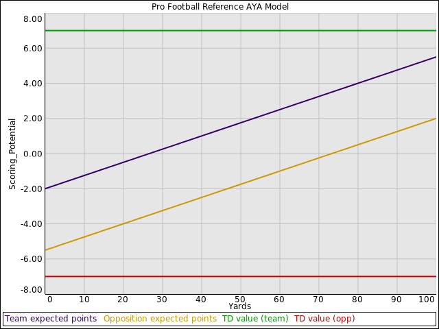
In order to deal with the issues raised above, I will introduce a new analytic metric for analyzing trade risk, the risk ratio, which is the sum of the AV values of  the picks given, divided by the sum of the AV values of the picks received. For trades with a ratio of 1.0 or less, there is no risk at all. For trades with ratios approaching 2 or so, there is substantial risk. We are now aided in this kind of analysis by Pro Football Reference’s new average AV per draft pick chart. This is a superior tool to their old logarithmic fit, because while the data may be noisy, they avoid systematically overestimating the value of first round picks.

The eight first round trades of 2012, interpreted in terms of AV risk ratios.

The first thing to note about the 8  trades is that the risk ratio of 6 of them is approximately the same. There really is no difference, practically speaking, in the relative risk of the Trent Richardson  trade, or the Morris Claiborne trade,  or the Fletcher Cox trade. Of the two remaining trades, the Justin Blackmon trade was relatively risk free. Jacksonville assumed an extra value burden of 10% for moving up to draft the wide receiver. The other outlier, Harrison Smith, can be explained largely by the noisy data set and an unexpectedly high value of AV for draft pick 98. If you compensate by using 13 instead of 23 for pick #98, you get a risk ratio of approximately 1.48, more in line with the rest of the data sets.

Armed with this information, and picking on Morris Claiborne, how good does he  have to be for this trade to be break even? Well, if his career nets 54 AV, then the trade breaks even. If he has a HOF career (AV > 100), then Dallas wins big. The same applies to Trent Richardson. For the trade to break even, Trent has to net at least 64 AV throughout his career. Figuring out how much AV Doug Martin has to average is a little more complicated, since there were multiple picks on both sides, but Doug would carry his own weight if he gets 21*1.34 ≈ 28 AV.

Four historic trades and their associated risk ratios.

By historic measures, none of the 2012 first round trades were particularly risky. Looking at some trades that have played out in  the past, and one  that is still playing out, the diagram above shows the picks traded for Julio Jones, for Michael Vick, for Tony Dorsett, and also for Earl Campbell.

The Julio Jones trade has yet to play out, but Atlanta, more or less, assumed as much risk (93 AV) as they did for Michael Vick (94 AV), except for a #4 pick and a wide receiver. And although Michael is over 90 AV now, counting AV earned in Atlanta and Philadelphia, he didn’t earn the 90+ AV necessary to balance out the trade while in Atlanta.

Tony Dorsett, with his HOF career, paid off the 96 AV burden created by trading a 1st and three 2nd round choices for the #2 pick. Once again, the risk was high, the burden was considerable, but it gave value to Dallas in the end.

Perhaps the most interesting comparison is the assessment of the Earl Campbell trade. Just by the numbers, it was a bust. Jimmie Giles, the tight end that was part of the trade,  had a long and respectable career with Tampa Bay. That, along with the draft picks, set a bar so high that only the Ray Lewis’s of the world could possibly reach. And while Campbell was a top performer, his period of peak performance was short, perhaps 4   years. That said, I still wonder if Houston would still make the trade, if somehow someone could go back in to the past, with the understanding of what would happen into the relative future. Campbell’s peak was pretty phenomenal, and not entirely encompassed by a mere AV score.

These are numbers that have been published before, but not presented as artfully as this. PFR has the average draft value of a draft pick on a per draft slot basis. They then find a representative player with that AV. Also, they’ve listed the best picks in the slot as well. Looking to pick a world beater?

The url for this page suggests that  the page is temporary. Hopefully it will become a permanent part of Pro Football Reference.

Update: The url has been removed from the Pro Football Reference site, but is available from the Wayback Machine here.

The Stathead blog is now defunct and so, evidently, is the Pro Football Reference blog. I’m not too sure what “business decision” led to that action, but it does mean one of the more neutral and popular meeting grounds for football analytics folks is now gone. It also means that Joe Reader has even less of a chance of understanding any particular change in PFR. Chase Stuart of PFR is now posting on Chris Brown’s blog, Smart Football.

The author of the Armchair Analysis blog, Jeff Cross, has tweeted me telling me that a new play by play data set is available, which he says is larger than that of Brian Burke.

Early T formations, or not?

Currently the Wikipedia is claiming that Bernie Bierman of the University of Minnesota was a T formation aficionado

U Minnesota ran the T in the 1930s? Really?

I’ve been doing my best to confirm or deny that. I ordered a couple books..

No mention of Bernie's T in this book.

I've skimmed this book, and haven't seen any diagrams with the T or any long discussion of the T formation. There are a lot of unbalanced single wing diagrams, though.

I also wrote Coach Hugh Wyatt, who sent me two nice letters, both of which state that Coach Bierman was a true blue single wing guy. In his book, “Winning Football”, I have yet to find any mention of the T, and in Rick Moore’s “University of Minnesota Football Vault”, there is no mention of Bernie’s T either.

I suspect an overzealous Wikipedia editor had a hand in that one. Given that Bud Wilkinson was one of Bernie’s players, a biography of Bud Wilkinson could be checked to see if the T formation was really the University of Minnesota’s major weapon.